The design manual for CreaTeME describes the use of visual elements and provides downloads for the CreaTeME logo and other relevant assets.
Naming
The name CreaTeME serves as the primary identity marker for the center, acting as both a visual representation of our core philosophy and a precise acronym for Creative use of Technology in Music Education. To ensure brand integrity and global recognition, it is imperative that the name is consistently rendered with its unique capitalization.
To maintain professional clarity, the name must always appear in its specific typographic form. Deviations from this standard dilute the brand’s visual impact and obscure the meaning of the acronym. The name should be written exclusively as CreaTeME. Avoid standardizing the casing or using alternative formats such as Createme, CREATEME, createME, CreateMe, CreaTeMe, or other variants.
Logo
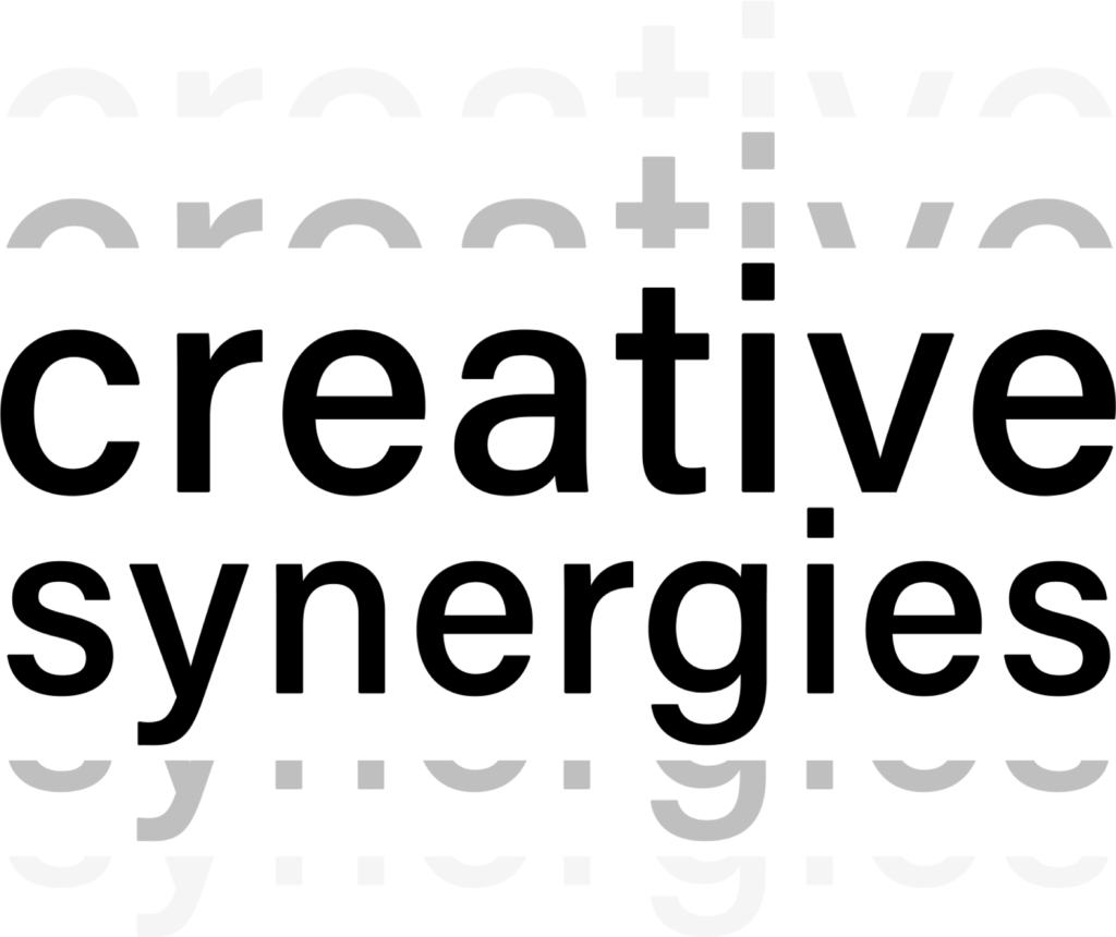
The CreaTeME logo is a visual mark that combines clean lines with a modern typeface, ensuring a professional presence across all platforms. By balancing the graphics with generous clearspace, the logo maintains its professionalism and instant recognition, whether appearing in isolation or alongside other brand elements.
Logos, colors and variation
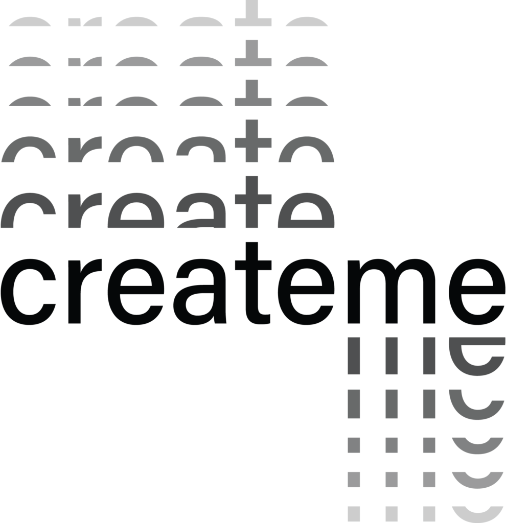
The CreaTeME logo is designed for clarity and high visibility. To ensure it stays sharp and professional, we use two versions — one full-sized version and one compact version. Both exists in dark and light colors.
By choosing the version that offers the compatibility with your content, and the best contrast against the background, the logo remains easy to read and recognize across all platforms.
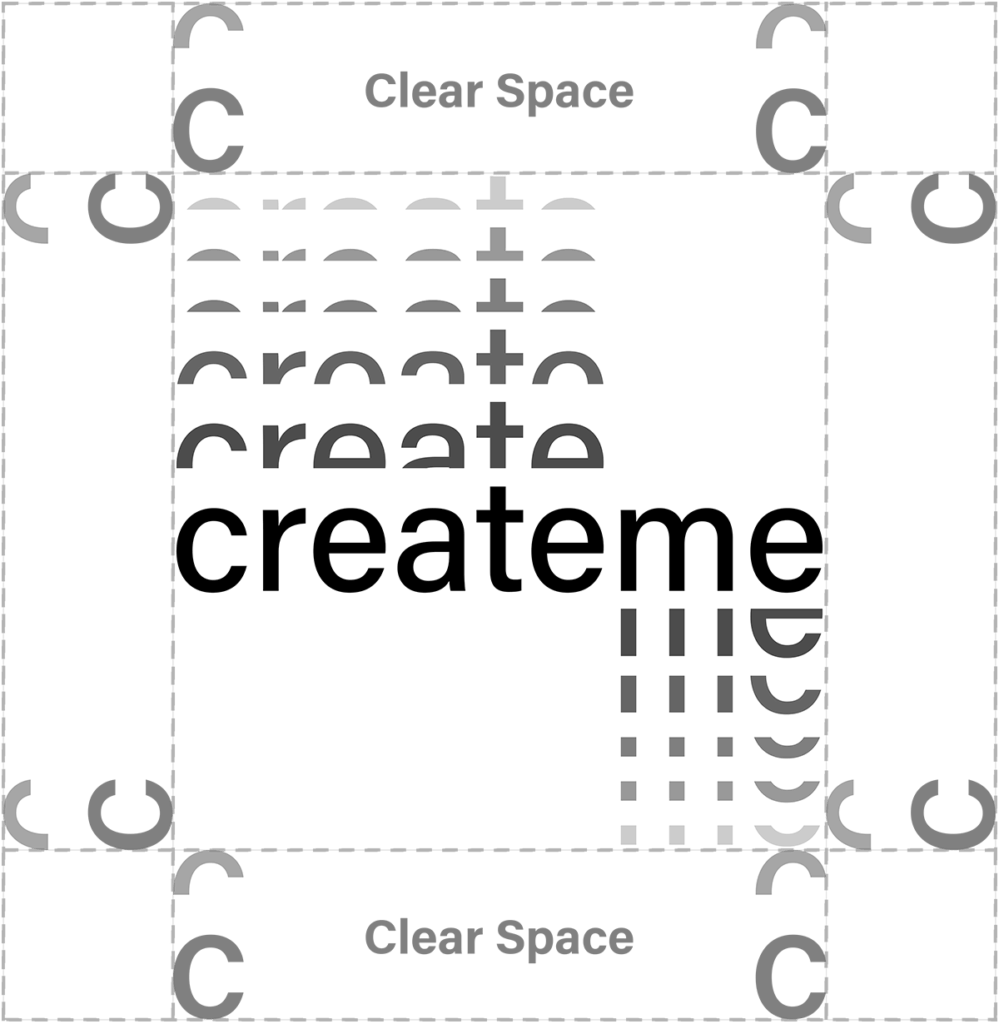
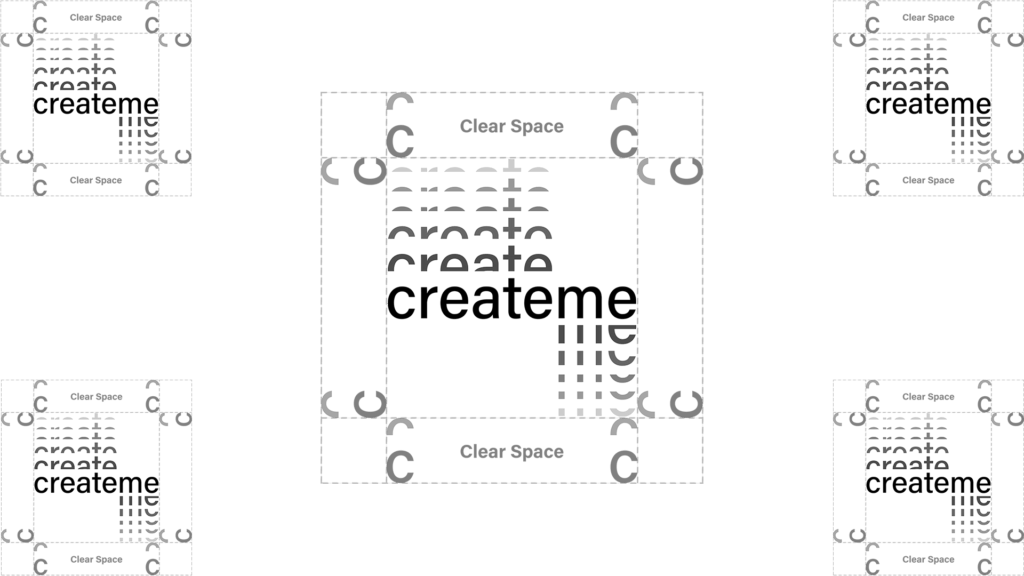
Logo clear space guidelines
To maintain high visibility, the CreaTeME logo requires a minimum clear space on all sides. Defined by the ‘C’ + the halved ‘C’ above, this safety zone ensures the logo remains uncluttered and distinct from other elements or layout edges.
As a general rule, the CreaTeME logo can be placed in either corner, or centered within presentations and videos. Place the logo according to the guidelines for clear space to maintain good visibility.
Other logos
CreaTeME serves as an umbrella for several specialized initiatives, many of which feature their own unique logos. These project identities are not standalone designs; they are strictly based on the CreaTeME visual framework to ensure a cohesive “family resemblance” across the entire center. By utilizing the same core typography, geometric logic, and stylistic principles, these logos maintain a clear connection to the original design while highlighting specific project’s uniqueness. All project-specific assets, including various file formats and co-branded versions, are available for download below.
Colors
CreaTeME utilizes yellow as its primary signature color. To ensure a modern and balanced aesthetic, this vibrant color is supported by a palette of lighter tones. These supporting colors provide a clean feel that enhances readability while making the yellow stand out as our distinct brand identifier.
Color Variations
Primary
#F6D738
RGB 246 215 56
CMYK 4 12 87 0
Secondary
#FFF9E8
RGB 255 249 232
CMYK 0 2 9 0
Accent
#371D12
RGB 55 29 18
CMYK 0 47 67 78
Grey
#F5F5F5
RGB 245 245 245
CMYK 0 0 0 4
Grey on grey
#E7E7E7
RGB 231 231 231
CMYK 0 0 0 9
Fonts
Our primary typeface, Acumin, follows the standard of University of Agder, and is a versatile and expansive font family. It is designed for clarity and legibility across screens, print, and signage. While Acumin remains neutral and timeless, it becomes more expressive when using its thinnest and boldest weights.
If Acumin is unavailable, we use the following alternatives: Helvetica – a modern classic with the same neutral feel as Acumin, and Arial – available on most devices, providing a clean and legible appearance.
Other design elements
To ensure a cohesive user experience, our design language includes specific guidelines for core interface elements. We have defined standardized rules for border radius and buttons to maintain visual consistency across all digital products. These patterns help create a predictable and intuitive flow, ensuring that every interaction feels distinctly like CreaTeME.
Border Radius
We use a 20px border radius as our standard for web elements to ensure a soft, modern aesthetic. However, since different software and rendering engines can interpret pixel values differently in practice, the priority is visual consistency. The goal is to ensure that buttons and containers appear uniform across all platforms, regardless of the specific technical implementation.
Border Radius: 20px
Buttons
Buttons should seamlessly integrate with our visual identity by utilizing our established color palette while maintaining a clean, uncluttered appearance. To ensure a premium feel, incorporate a generous amount of padding or “air” around the text to avoid a cramped impression. Every button must feature a fully rounded, pill-shaped silhouette where the border radius creates a perfect half-circle on each side, intentionally avoiding the look of a rounded square.
For ease of implementation, a pre-styled template reflecting these specific design choices is readily available within the website editor.
To ensure a cohesive visual identity across all platforms, a standardized suite of downloadable assets is available for staff, partners, and collaborators. These files are the building blocks of the CreaTeME brand and must be used in accordance with the guidelines outlined in this manual.
Colors
CreaTeME utilizes yellow as its primary signature color. To ensure a modern and balanced aesthetic, this vibrant color is supported by a palette of lighter tones. These supporting colors provide a clean feel that enhances readability while making the yellow stand out as our distinct brand identifier.
CreaTeME Primary
#F6D738
RGB 246 215 56
CMYK 4 12 87 0
CreaTeME Secondary
#FFF9E8
RGB 255 249 232
CMYK 0 2 9 0
Accent
#371D12
RGB 55 29 18
CMYK 0 47 67 78
Grey
#F5F5F5
RGB 245 245 245
CMYK 0 0 0 4
Grey on grey
#E7E7E7
RGB 231 231 231
CMYK 0 0 0 9
Cookie Consent
We use cookies to improve your experience on our site. By using our site, you consent to cookies.
This website uses cookies
Websites store cookies to enhance functionality and personalise your experience. You can manage your preferences, but blocking some cookies may impact site performance and services.
Essential cookies enable basic functions and are necessary for the proper function of the website.
Name
Description
Duration
Cookie Preferences
This cookie is used to store the user's cookie consent preferences.
30 days
Google Tag Manager simplifies the management of marketing tags on your website without code changes.
Name
Description
Duration
cookiePreferences
Registers cookie preferences of a user
2 years
td
Registers statistical data on users' behaviour on the website. Used for internal analytics by the website operator.

